

Concept
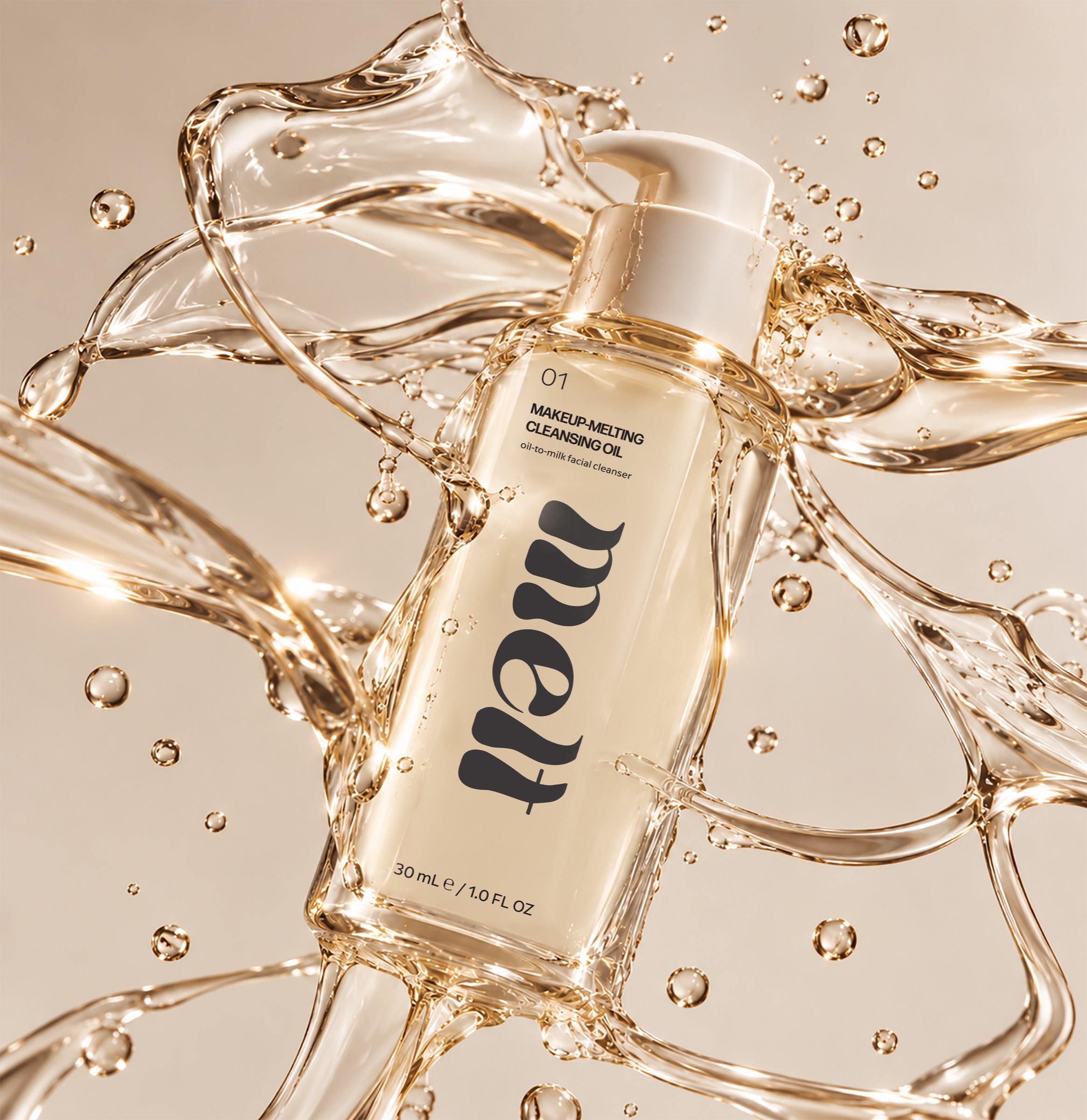
Melt is a clean-skincare brand built around a single idea: makeup should melt away as easily as the name suggests. Its first product, a makeup-melting cleansing oil, transforms from a silky oil into a milky emulsion on contact with water. The soft, fluid wordmark echoes that transformation, with letterforms that look like they are dripping and pooling, while a calm palette of porcelain, charcoal, and ink with clean sans-serif type keep the brand feeling modern, gentle, and trustworthy.
Description
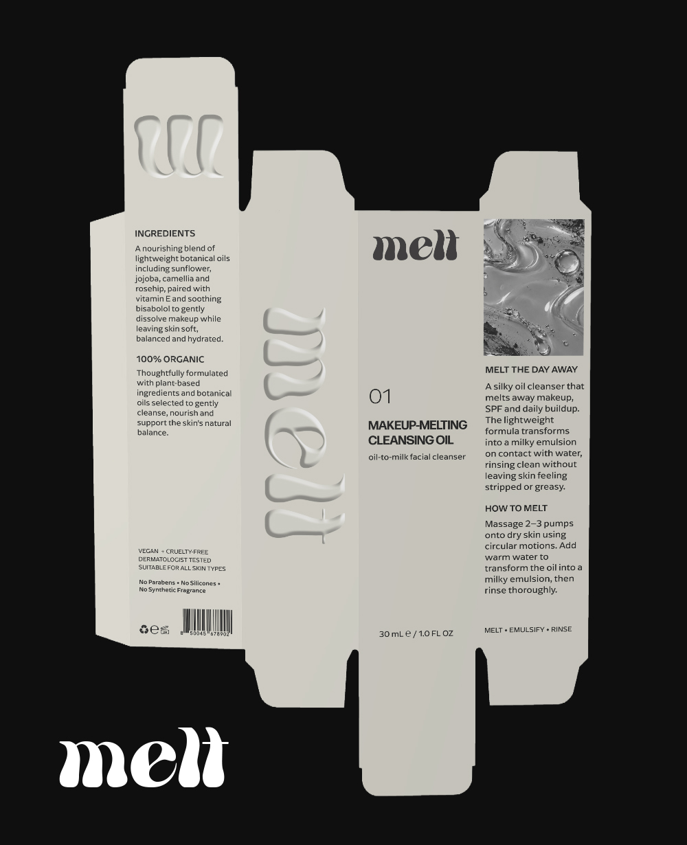
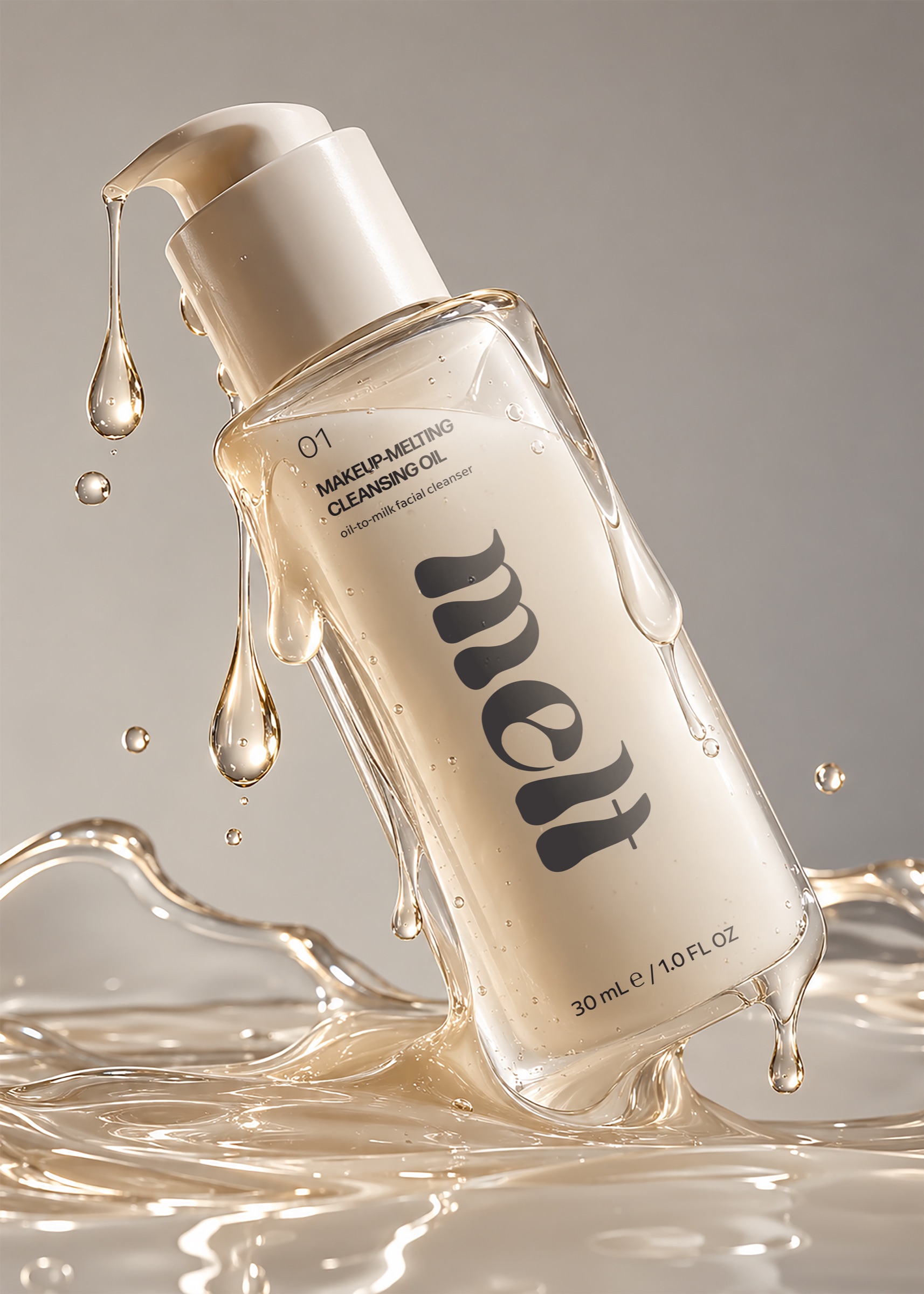
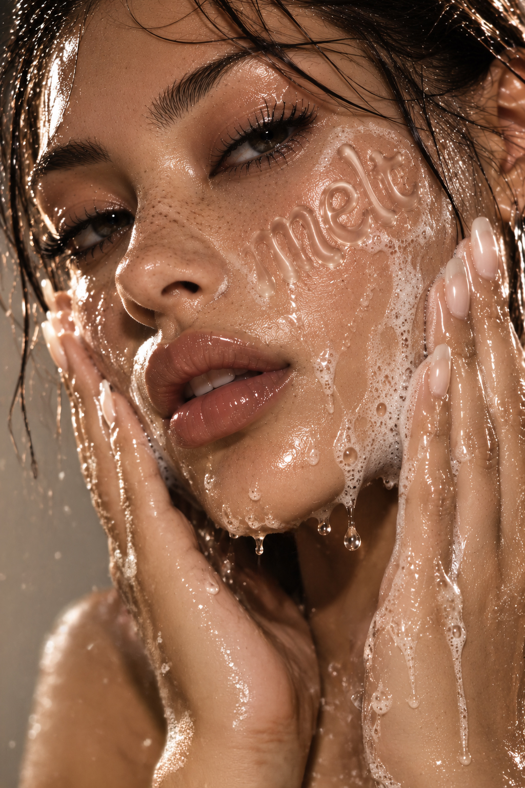
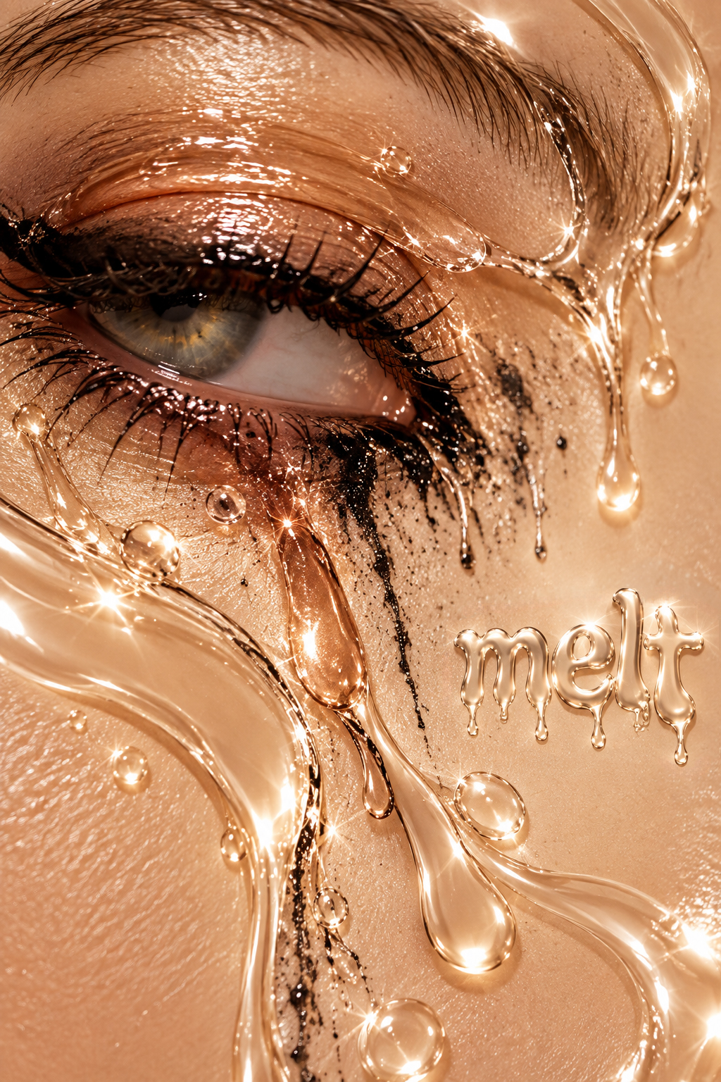
This project covered the full packaging system for Melt's cleansing oil: a custom tuck-end paperboard carton, the bottle label, and the supporting product copy, ingredients, usage directions, and regulatory details. The dieline was built panel by panel so the wordmark, product information, and imagery each land in the right place when folded. A key feature of the carton is embossing: the fluid Melt wordmark is raised off the front and side panels, giving the box a soft, tactile surface that mirrors the glossy, liquid quality of the oil inside and invites customers to pick it up. The packaging was then brought to life through 3D product animations and a glossy campaign of product and beauty imagery that carries the melting, liquid-gold feel across every touchpoint.
Target Market
Melt is aimed at women roughly 18 to 35 who wear makeup and SPF daily and care about what goes on their skin. They are drawn to clean, vegan, and cruelty-free formulas, follow skincare trends like double cleansing, and look for products that feel like a small luxury without a luxury price. The brand sits alongside modern skincare lines sold at retailers like Sephora and Ulta, so the packaging needed to feel elevated and minimal on the shelf while still communicating its benefits clearly: 100% organic, suitable for all skin types, and free of parabens, silicones, and synthetic fragrance.

Typography
The quick brown fox jumps over the lazy dog.
The quick brown fox jumps over the lazy dog.
The quick brown fox jumps over the lazy dog.