

Concept
As a longtime fan of Coca-Cola and its iconic visual identity, I created this independent advertising concept as a personal exploration of the brand’s recognizable design language. The project experiments with Coca-Cola’s signature typography, color, and contour bottle to explore how familiar brand elements can be reinterpreted through conceptual advertising.
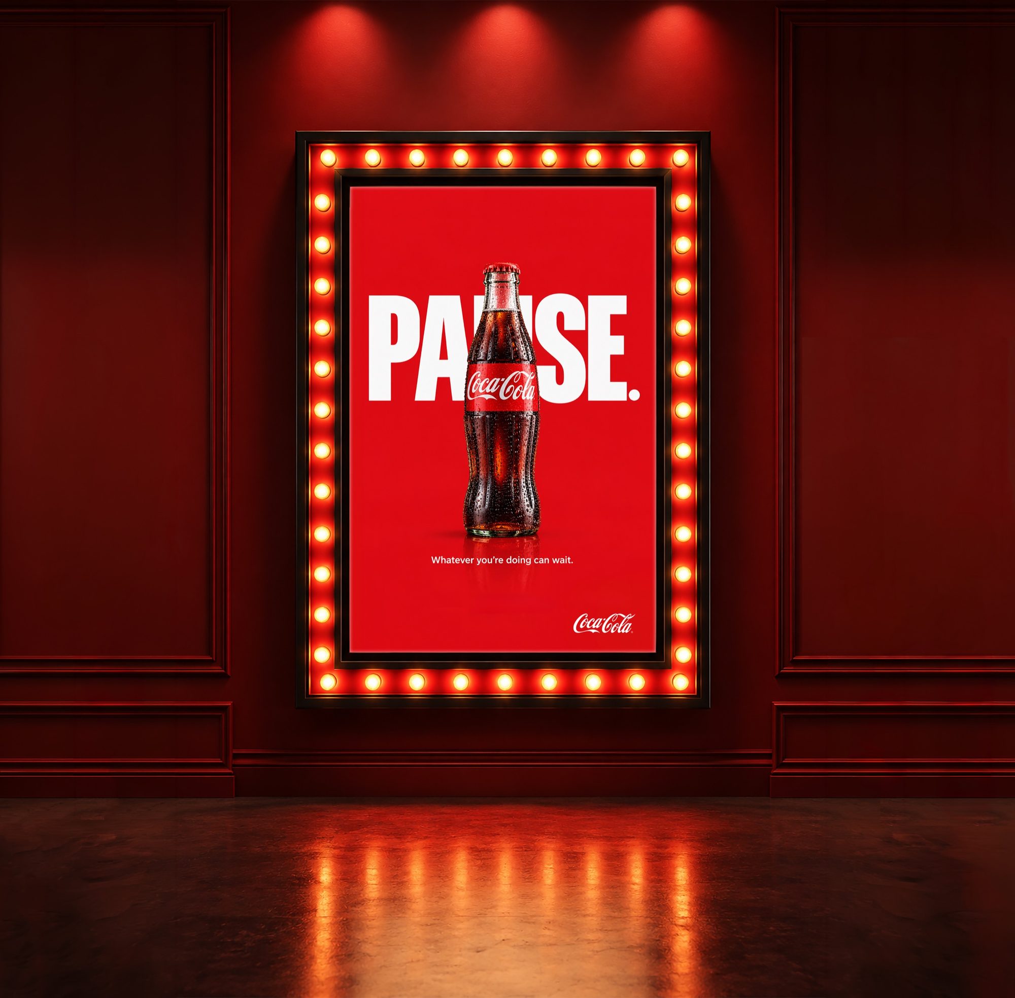
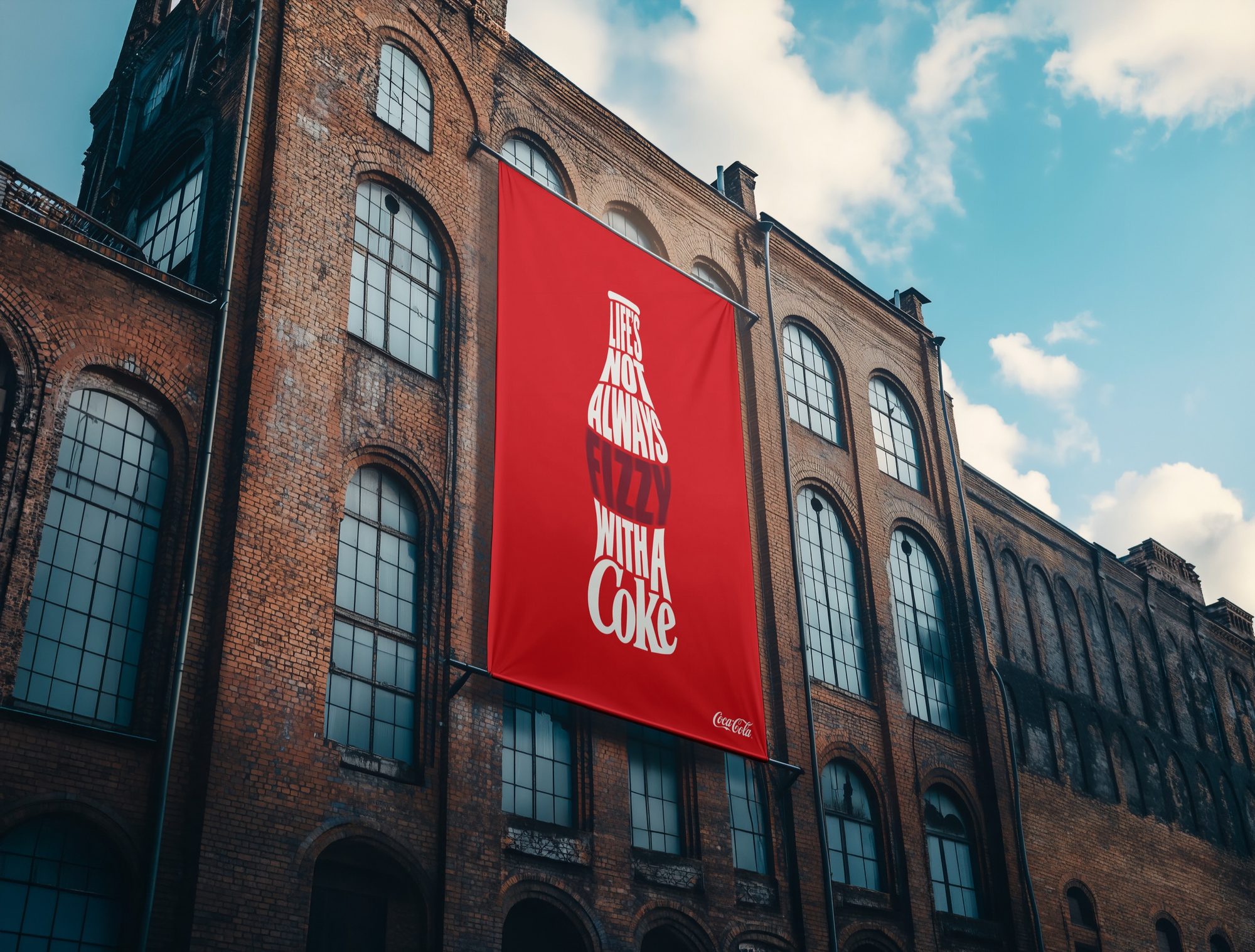
The first advertisement constructs the recognizable bottle silhouette through typography, allowing the message and product form to become a single visual. The second concept, “Pause.,” incorporates the bottle directly into the headline to reinforce the idea of taking a moment to stop, refresh, and enjoy a Coke.

Description
The campaign was developed as a personal fan project for portfolio and educational purposes, with a focus on conceptual advertising, typography, composition, and photo manipulation. The advertisements were designed for large-format environments, using bold scale, limited copy, and strong contrast to create messages that can be understood quickly from a distance.
The concepts were applied to an exterior building banner and illuminated marquee display to explore how the campaign could translate across different advertising formats. Supporting imagery and compositing were developed in Adobe Photoshop, while typographic and graphic elements were created and refined in Adobe Illustrator.
This project is an independent, unofficial fan concept and was not commissioned, sponsored, endorsed, or approved by The Coca-Cola Company. Coca-Cola, Coke, and associated trademarks and brand assets are the property of their respective owners.

Typography
The quick brown fox jumps over the lazy dog.